As we enter 2024, I can’t help but wonder what colors will dominate the year ahead. In this article, I will explore the latest trends in color and reveal what’s in and what’s out for the upcoming year. From vibrant hues that exude energy and excitement to serene tones that create a tranquil atmosphere, we will uncover the power of color and how it can transform any space. Additionally, we will delve into bold and playful color combinations that push boundaries and challenge traditional norms. And of course, we can’t forget about timeless neutrals that never go out of style. So, get ready to say goodbye to pastels as we embrace a new era of color trends in 2024.
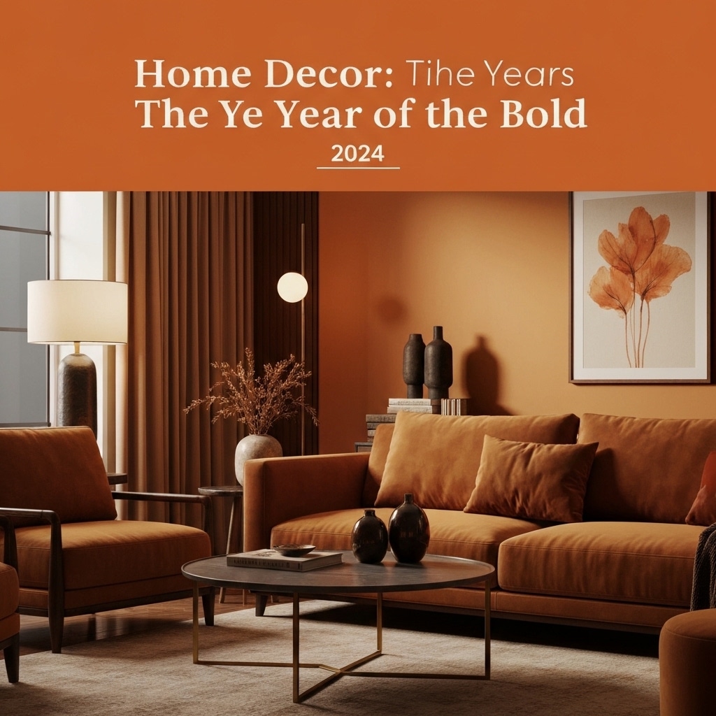
Vibrant Hues: Embrace the Power of Color
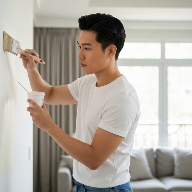
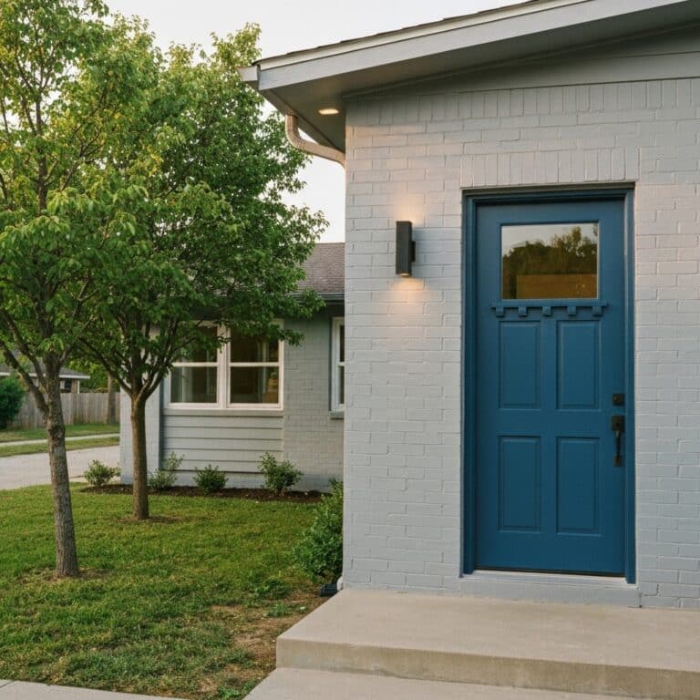
I absolutely love embracing the power of vibrant hues in my life. Exploring chromatic palettes and incorporating vibrant accent walls into my home decor has been a game-changer. The use of bold and lively colors instantly adds a sense of energy and personality to any space. Whether it’s a deep red accent wall in the living room or a bright yellow door in the entryway, these vibrant hues never fail to make a statement. They create a visual focal point and can transform even the dullest of rooms into a lively and inviting space. The beauty of vibrant hues is that they can be used in various ways, from small pops of color in accessories to larger, more dramatic statements. Embracing these colors has truly elevated the overall aesthetic and ambiance of my home.
Serene Tones: Creating a Tranquil Atmosphere
To create a tranquil atmosphere, incorporating a few calming shades into your home’s color scheme can make a significant difference. Serene tones, such as soft blues, gentle greens, and muted grays, can help create a calming ambiance that promotes relaxation and tranquility. These nature-inspired hues evoke a sense of peace and harmony, bringing the beauty of the outdoors into your living space. By incorporating these serene tones into your home decor, you can create a space that feels like a peaceful retreat, allowing you to unwind and recharge after a long day. Whether it’s through painting the walls, adding accents, or incorporating furniture in these calming shades, embracing serene tones can transform your home into a soothing sanctuary.
Bold and Playful: Exploring Unexpected Color Combinations
Incorporating unexpected color combinations can add a bold and playful touch to your home’s color scheme, taking the serene tones discussed earlier to a whole new level of creativity and vibrancy. By experimenting with edgy patterns and unconventional pairings, you can create a truly unique and eye-catching look for your space. Consider pairing a vibrant yellow with a deep navy blue for a striking contrast, or mix a soft pastel pink with a bold emerald green for a playful twist. Don’t be afraid to think outside the box and embrace colors that don’t traditionally go together. The key is to have fun and let your creativity shine through in your home’s design.
Timeless Neutrals: Classic Shades That Never Go Out of Style
When it comes to timeless neutrals, classic shades like beige and gray are always a reliable choice for creating a sophisticated and versatile color palette. These colors exude timeless elegance and enduring sophistication, making them a staple in interior design. Beige, with its warm undertones, adds a sense of warmth and tranquility to any space. It pairs well with a variety of other colors and can be used as a base to showcase other design elements. On the other hand, gray is known for its versatility and ability to create a calming ambiance. Its cool undertones make it a perfect backdrop for both modern and traditional styles. Whether used on walls, furniture, or accessories, these classic neutrals never go out of style and continue to bring a touch of elegance to any room.
Say Goodbye to Pastels: The Fading Trend of Soft Colors
I’ve noticed a decline in the popularity of soft colors, such as pastels, as they no longer seem to be in favor among current color trends. There has been a fading of pastels in recent times, with a shift towards bolder shades taking their place. It seems that people are now gravitating towards more vibrant and eye-catching colors, leaving behind the subtle and muted tones of pastels. This shift can be seen in various industries, from fashion to home decor. Bold and saturated hues have become the new go-to for those looking to make a statement with their color choices. Whether it’s a vibrant red or a bold blue, these bolder shades are now dominating the color landscape and leaving pastels behind.
Conclusion
After exploring the upcoming color trends for 2024, it is clear that vibrant hues, serene tones, and bold and playful combinations will dominate the design world. These colors have the power to evoke emotions and create dynamic spaces that capture attention. However, it’s time to bid farewell to pastels as they fade in popularity. Embrace the power of color and stay ahead of the trends to create a visually stunning and captivating environment.