Coincidentally, I’ve always been fascinated by the impact colors have on our emotions and well-being. That’s why I am excited to share with you the power of color psychology in design. In this guide, we will explore how different colors can evoke specific emotions and how we can use this knowledge to create purposeful and impactful designs. From warm colors that make spaces feel inviting, to cool colors that bring a sense of calm, and even bold and vibrant colors that add energy and excitement, we will uncover the secrets behind color selection. By understanding the psychological effects of colors, we can create spaces that not only look beautiful but also elicit the desired emotional response. So, let’s dive in and start painting with purpose!

The Power of Color Psychology
I personally believe in the immense power of color psychology. The psychology of color choice is a fascinating field that explores how different colors can influence our mood and emotions. Colors have the ability to evoke specific feelings and can even impact our behavior. For example, warm colors like red and orange are often associated with energy and excitement, while cool colors like blue and green are known to promote calmness and relaxation. By understanding the psychological impact of color, designers can strategically use color to influence the mood of their audience. Whether it is creating a serene environment with soft blues or stimulating creativity with vibrant yellows, color psychology plays a crucial role in design and can greatly enhance the overall experience for individuals.
Understanding the Emotional Impact of Colors
To fully utilize color psychology in design, it is essential to comprehend the emotional impact that different colors can have. Color symbolism plays a crucial role in understanding how colors can evoke specific emotions and create a particular atmosphere. By using color theory effectively, designers can harness the power of colors to influence human perception and behavior. For example, warm tones like red and orange can evoke feelings of excitement and passion, while cool tones like blue and green can create a sense of calmness and tranquility. Additionally, colors can also be culturally significant, carrying different meanings in various societies. By understanding the emotional impact of colors and their symbolic significance, designers can create visually appealing and emotionally engaging designs that resonate with the target audience.
Using Warm Colors to Create a Welcoming Atmosphere
When it comes to creating a welcoming atmosphere, warm colors are key. They have the power to evoke feelings of comfort, relaxation, and happiness. By using warm colors in your design, you can create an inviting and cozy space that instantly puts people at ease.
Warm Colors for Ambiance
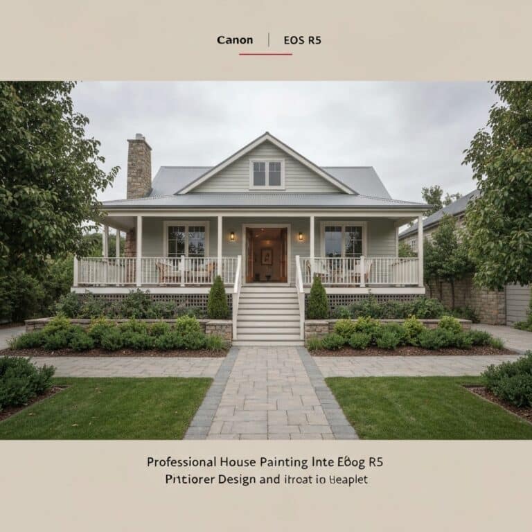
Creating a warm and inviting atmosphere can be achieved through the strategic use of warm colors in design. Warm colors, such as reds, oranges, and yellows, have the ability to create a cozy ambiance that welcomes people in. By incorporating these hues into your design, you can instantly transform a space into a comfortable and inviting environment. Cozy color combinations, like warm browns and soft creams, can evoke feelings of warmth and relaxation. These color choices can be used in various design elements, such as wall paint, furniture, and accessories, to create a harmonious and inviting atmosphere. Whether it’s a living room, bedroom, or dining area, using warm hues can make a space feel cozy and welcoming, ensuring that people feel comfortable and at ease in their surroundings.
Creating Inviting Color Schemes
I achieve a welcoming atmosphere by incorporating warm colors into my design using a combination of reds, oranges, and yellows. To create a sense of contrast and visual interest, I make sure to use contrasting hues within this color palette. For example, I might pair a vibrant orange with a deep red or a golden yellow with a burnt orange. This adds depth and dimension to the space, making it more inviting and engaging. Additionally, I find that incorporating natural elements into the design further enhances the welcoming atmosphere. Whether it’s through the use of organic textures, such as wood or stone, or the inclusion of plants and flowers, these elements bring a sense of warmth and tranquility to the space, making it feel like a true sanctuary.
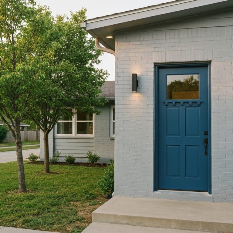
Harnessing the Calming Influence of Cool Colors
To achieve a sense of tranquility in design, cool colors can be harnessed for their calming influence. Blue hues are particularly effective in creating a relaxing and serene atmosphere. The color blue has been found to lower blood pressure and heart rate, making it ideal for spaces where relaxation and tranquility are desired, such as bedrooms or meditation rooms.
Incorporating green tones into a design can also contribute to a soothing and refreshing environment. Green is often associated with nature and the outdoors, evoking feelings of peace and harmony. Studies have shown that exposure to the color green can reduce stress and improve mood. Adding green accents or using green as a dominant color in a space can create a sense of calm and rejuvenation.
Adding Energy and Excitement With Bold and Vibrant Colors
Using a variety of vibrant and bold colors can significantly enhance the energy and excitement in a design. Whether it’s in the form of a painting, an advertisement, or even an interior space, bold and vibrant colors have the power to energize and captivate. In interiors, vibrant colors can create a sense of dynamism and liveliness, making the space more inviting and engaging. In branding, bold and vibrant colors can be used to evoke a sense of excitement and enthusiasm, capturing the attention of potential customers and creating a memorable impression. Color psychology plays a crucial role in understanding how different colors can influence emotions and behaviors. By strategically incorporating bold and vibrant colors into design, we can create an atmosphere that is visually stimulating and full of energy.
Creating Balance and Harmony With Neutral Colors
Neutral colors provide a sense of balance and harmony to any design. When creating elegant neutrals, incorporating earth tones can enhance the overall aesthetic appeal. Earth tones, such as brown, beige, and gray, bring a natural and calming element to a space. They evoke feelings of warmth, stability, and timelessness. By using these colors in the right proportions, a designer can achieve a soothing and balanced atmosphere. Earth tones can be paired with other neutrals, such as white or cream, to create a sophisticated and elegant look. The use of neutral colors in design allows for versatility and adaptability, making it easier to incorporate different styles and elements. Ultimately, the goal is to create a harmonious and visually pleasing space that promotes a sense of tranquility and balance.
Conclusion
In conclusion, color psychology is a powerful tool that can greatly impact the emotional experience of design. By understanding the different effects of warm, cool, bold, vibrant, and neutral colors, designers can create spaces that evoke specific feelings and moods. So, next time you’re designing a room or choosing a color palette, remember the power of color psychology and paint with purpose to create an atmosphere that truly speaks to you and your audience. Let your colors be the voice that paints your story.